



Eatable Adventures
Brand Evolution · Art Direction · Web Design
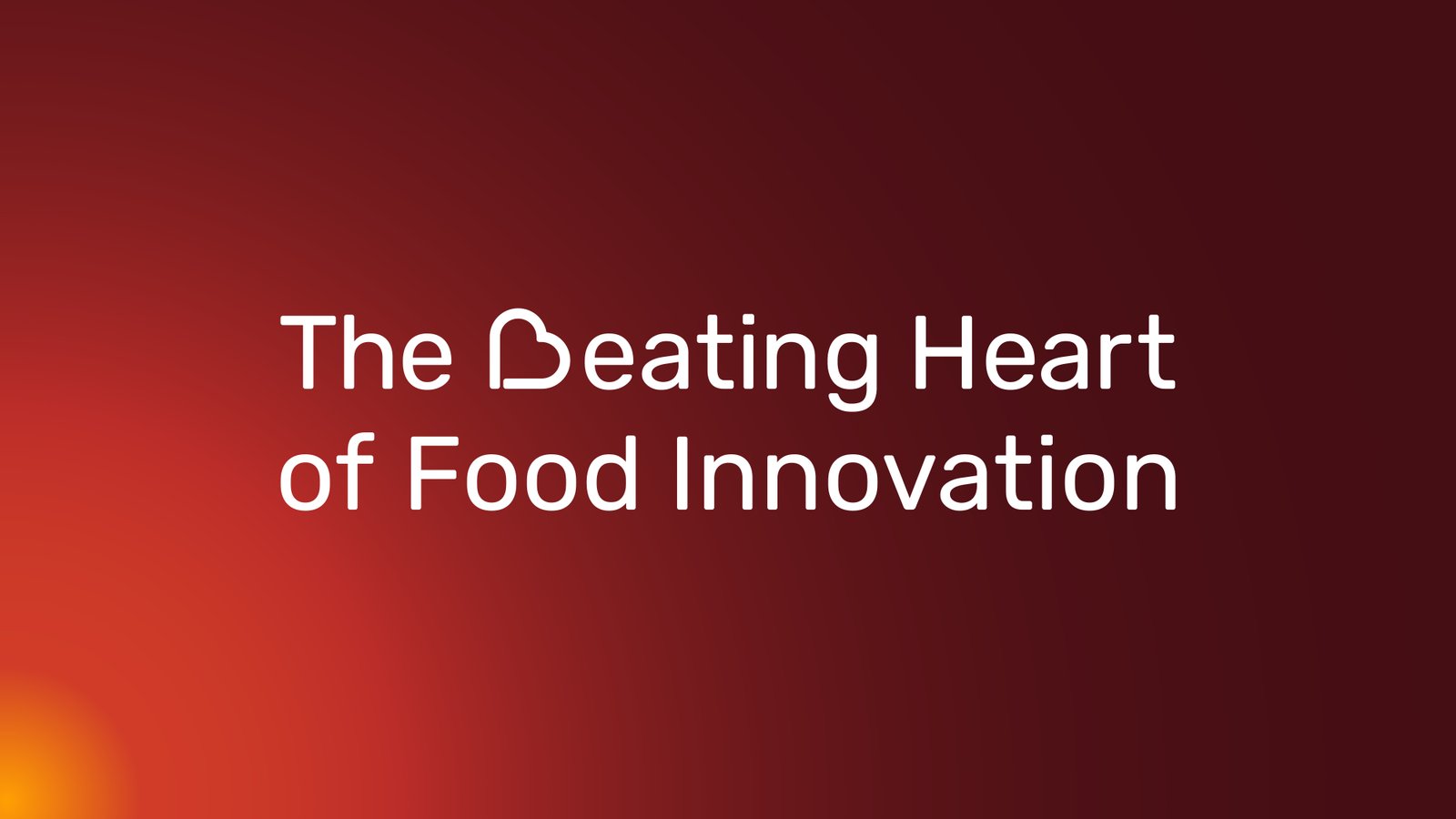
Brand evolution for Eatable Adventures, translating its new positioning, The beating heart of food innovation, into a visual system built around pulse, rhythm and impact.
- Client
- Eatable Adventures
- Sector
- Food Innovation
- Services
- Brand Evolution · Art Direction · Web Design · Brand Guidelines · Print & Digital Design
- Link
- Visit website ↗
The Challenge
Eatable Adventures had outgrown a visual identity that lacked consistency and no longer reflected the company's new stage, positioning or ambition. Its communications also made it difficult to understand what Eatable was, the role it played within the agrifood innovation ecosystem and, ultimately, its reason for being.
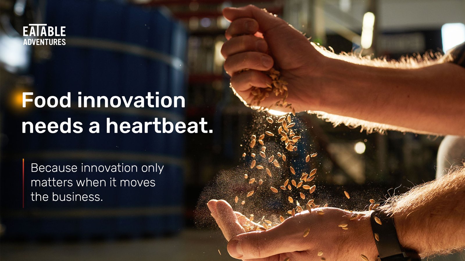
As part of a broader repositioning, Eatable's marketing team developed the claim The beating heart of food innovation, defining the brand as a driving force that connects, activates and moves innovation forward across the sector.
The challenge was to translate this new positioning into a contemporary visual language capable of expressing that sense of movement and momentum without relying on literal heartbeat imagery or familiar food innovation clichés. At the same time, the new identity needed to preserve a recognisable connection with the existing brand, as the project focused on evolving its wider visual universe rather than redesigning the logo.
The Solution
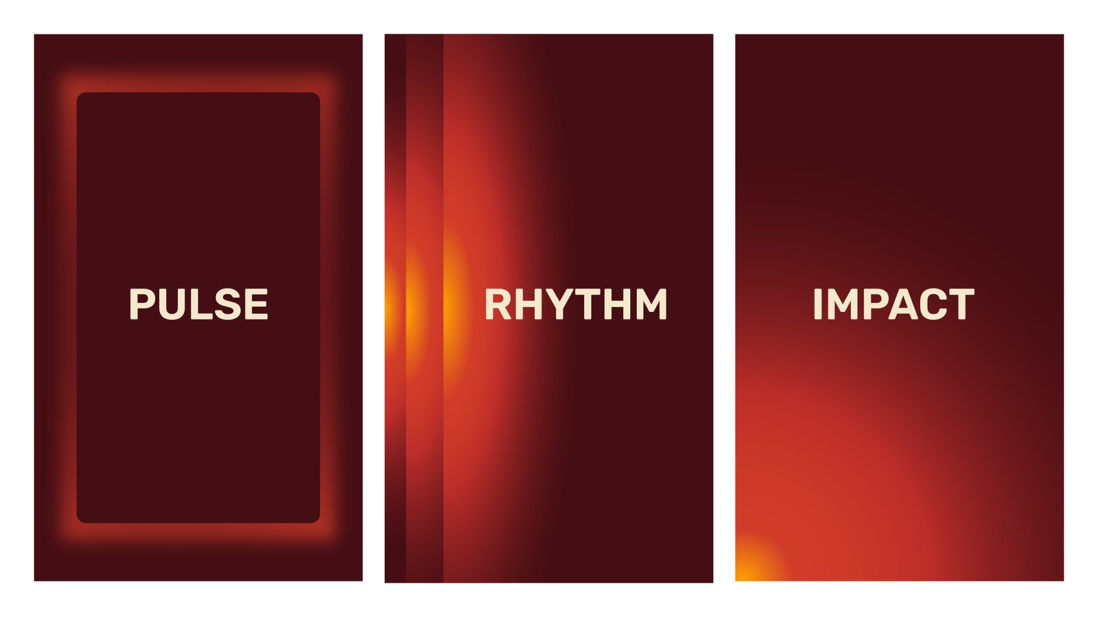
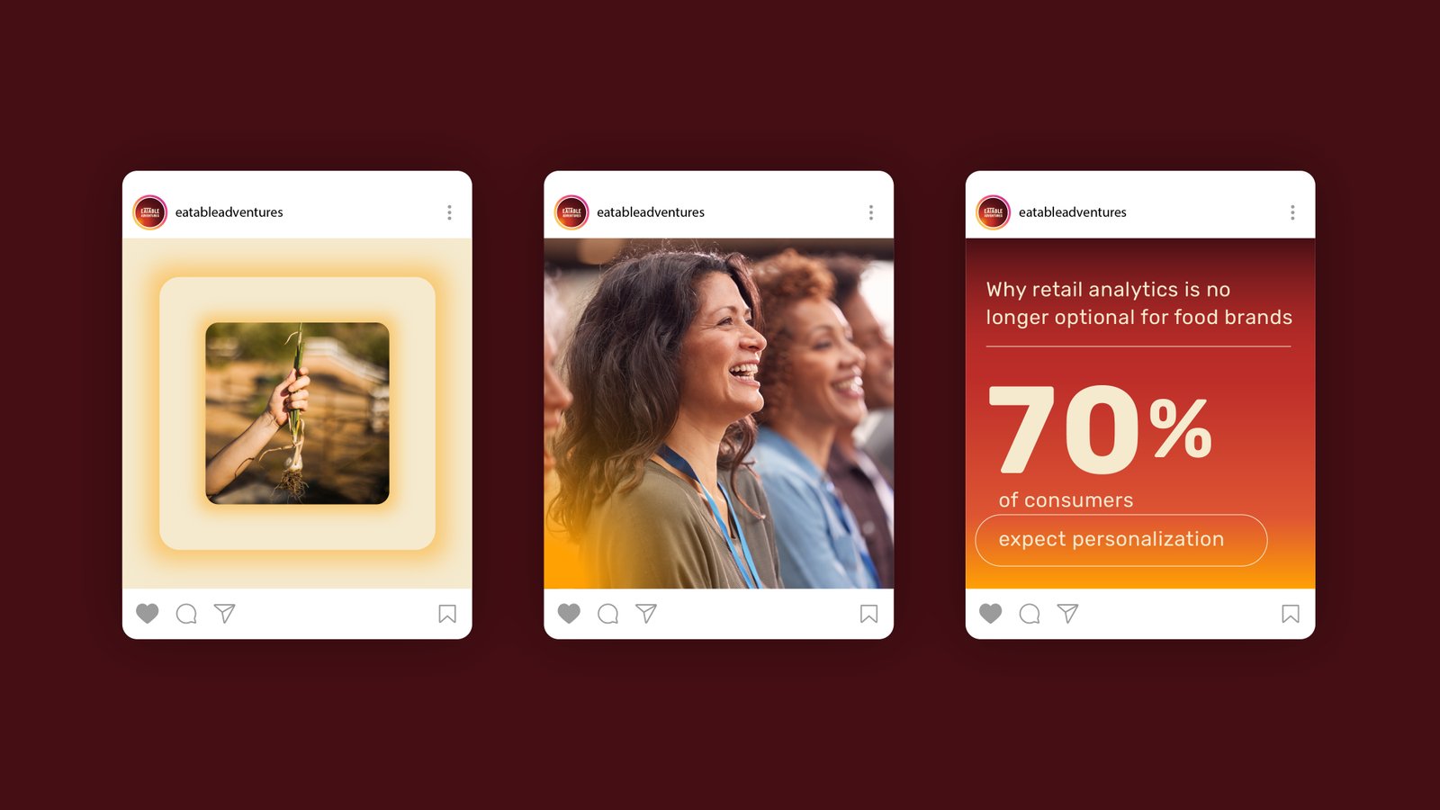
The new visual system was built around three interconnected states: Pulse, Rhythm and Impact.
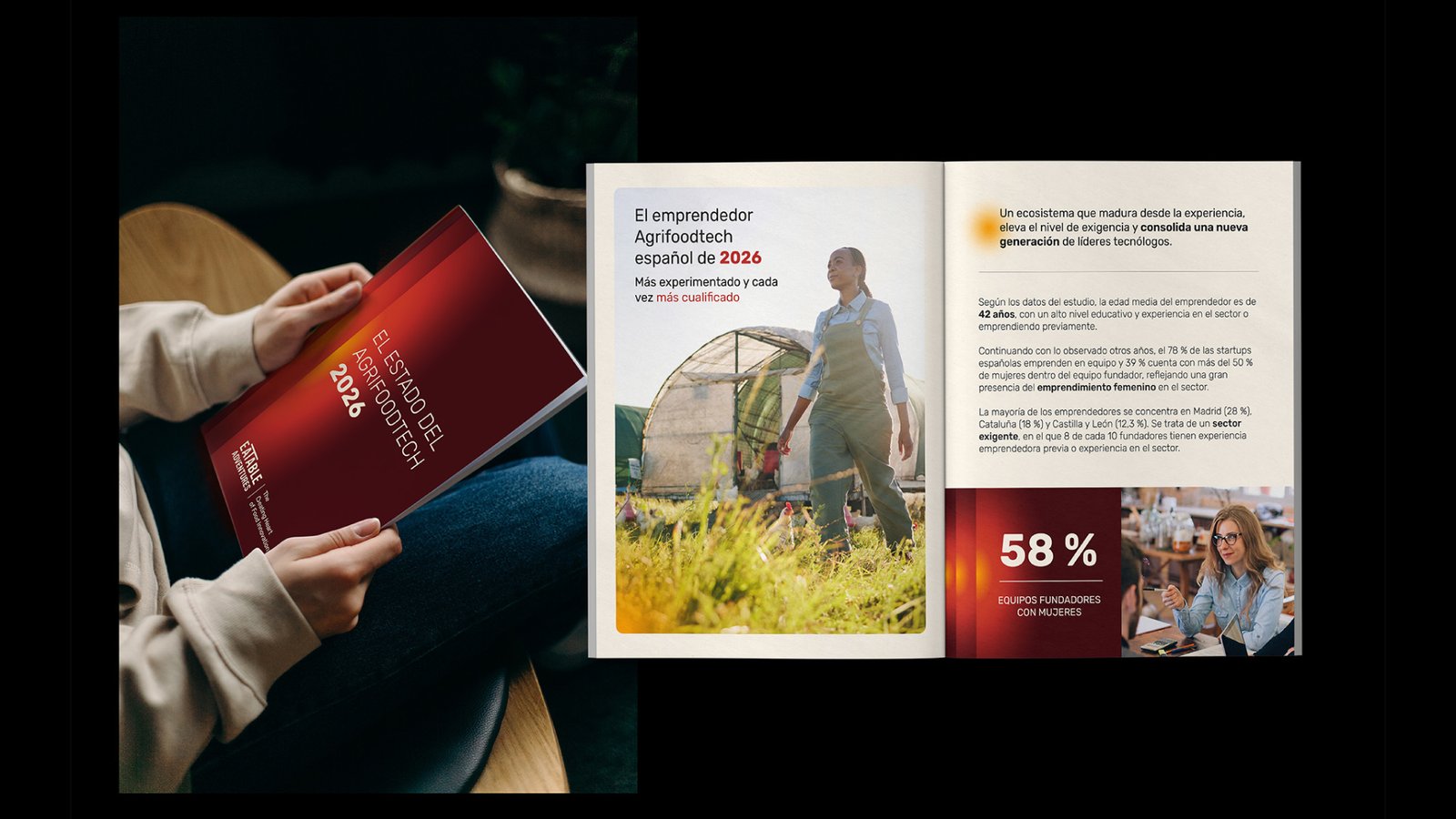
Pulse represents the spark that initiates movement and is used across calls to action and communications designed to activate. Rhythm represents the continuous work that turns ideas into action, appearing across events, activations, reports and initiatives that help move food innovation forward. Impact represents the result of that momentum, used to communicate case studies, outcomes, data and tangible change.
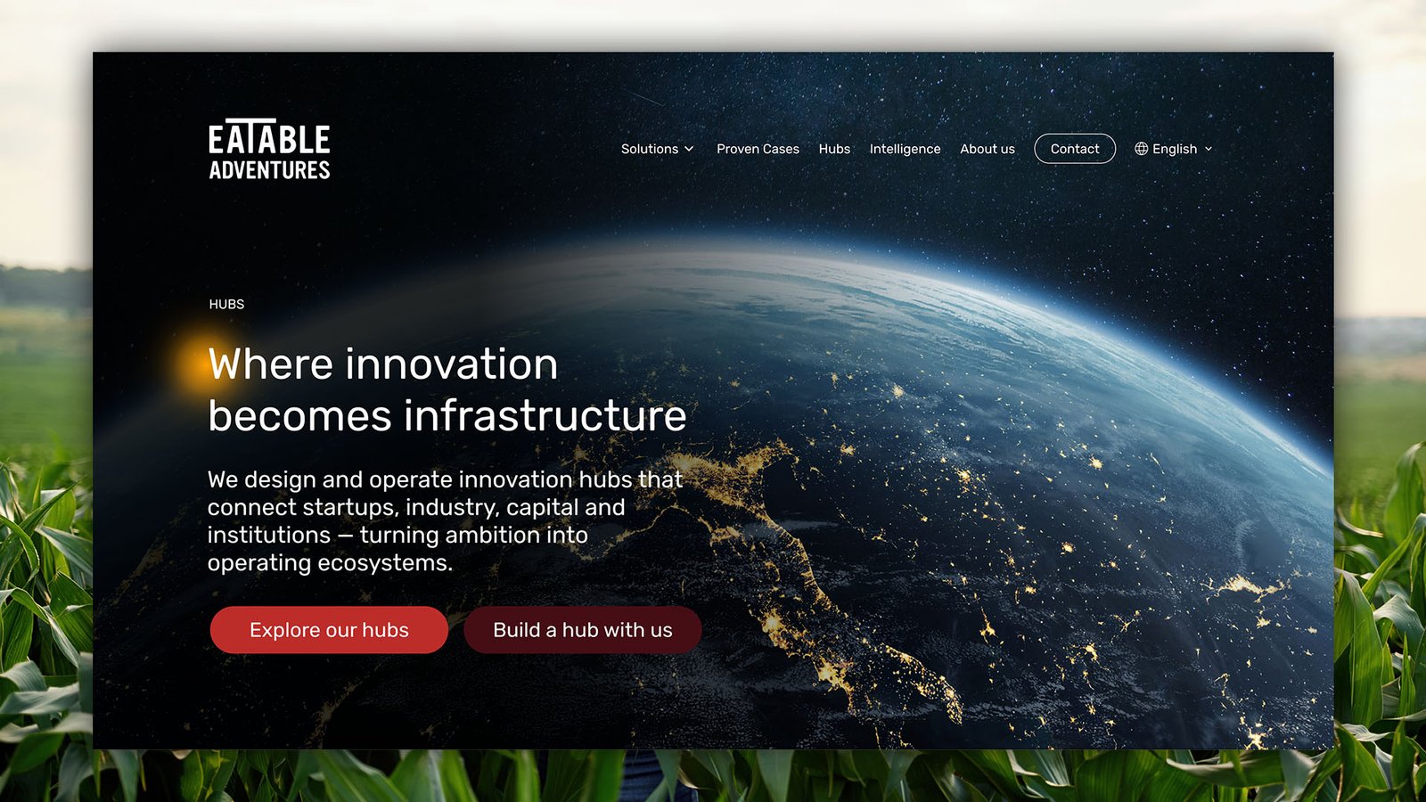
Each graphic language originates from a point of light, representing the moment something switches on and begins to expand. From that starting point, the system creates different visual expressions that connect every layer of the brand while giving each type of communication a clear purpose.
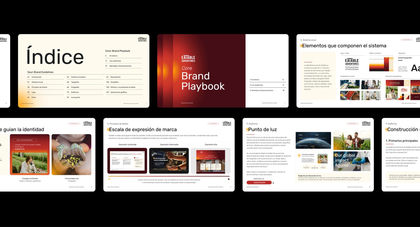
To maintain continuity with the previous identity, the existing colours became the starting point for an expanded palette. The tones were made more vibrant and expressive, creating a more contemporary visual language while preserving a recognisable connection with the brand's previous stage.
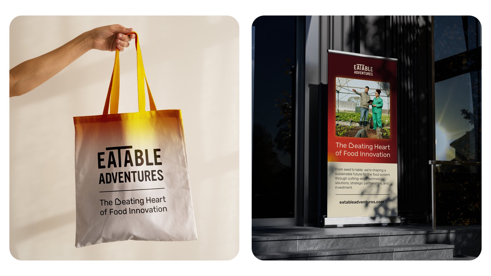
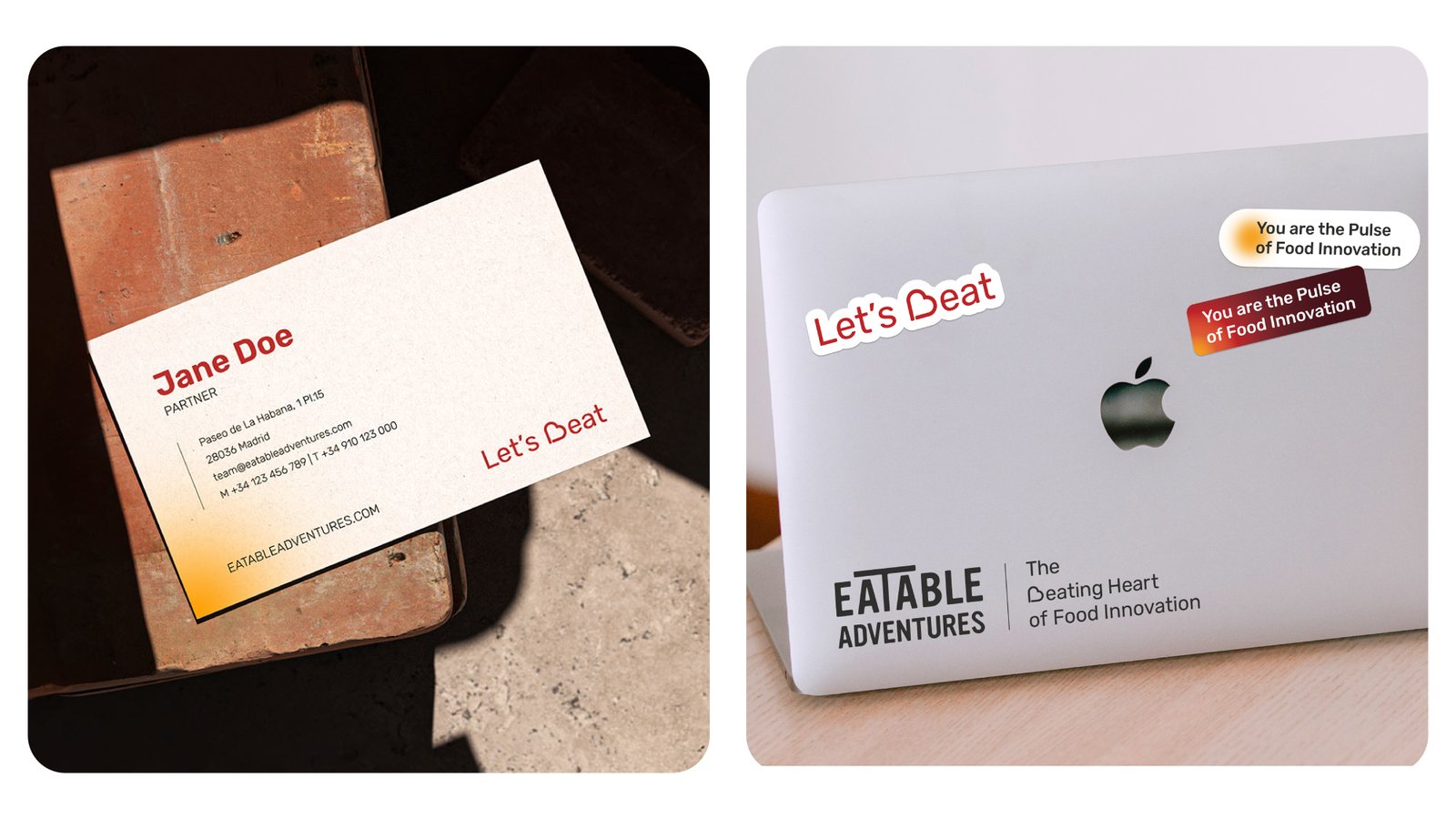
The system was documented in a new brand manual and extended across a redesigned website, printed materials and digital communications, creating a consistent brand experience across Eatable Adventures' different touchpoints.
Manifesto credits
Manifesto created in collaboration with Abismo Films. Script and editing by Abismo Films; art direction and graphic design by Nate Design Studio.
Have a project in mind?
Madrid · Worldwide · English / Spanish